ABR Capital Partners
Branding + Web Design + UI/UX + Art Direction
Transforming the oldest real estate investment bank in America.
ABR Capital Partners, formerly known as Alex. Brown Realty, is a privately-owned real estate investment manager founded in 1972 and headquartered in Baltimore, Maryland. ABR has a national footprint, co-investing with clients and partners in properties located throughout the United States. The firm has built a reputation as a trusted, highly focused, and value driven middle market real estate investor.
ABR approached Grady Campbell (the agency at which I undertook this project) for a modern rebranding; one which would uphold its prestige as one of the oldest investment banks in America, while updating its brand image for the 2020s and beyond.
Research
Market research and interviews with clients and partners revealed that ABR was known for its reliability, experience, and the expertise of its team. Its past branding as Alex. Brown Realty, while steeped in history, was clunky and overly formal, resulting in a website that was disorganised and hard to navigate. On the other hand, many of ABR’s real estate investment bank competitors had moved on to more modern branding, with dynamic websites and simple layouts often accompanied by thematic stock images.
Logo Redesign + Stationery Design
Keeping the original Alex. Brown Realty brand colour of royal vermilion, the redesigned ABR logo moved away from the firm’s original long and clunky name, instead opting for the abbreviation “ABR” and the full name “ABR Capital Partners,” which both updated the brand’s image for a more modern look and feel, and better reflected ABR’s current service offerings across real estate and private equity. The logo and type is simple and clean, opting for a brutalist feel to highlight ABR’s longstanding presence as an institution in the field.
The firm’s new logo was implemented across all official firm stationery, and all correspondence was to be sent in Helvetica Neue, at a set gray tone — a hue that complements the logo without drowning it out (as a typical black tone would).


Website Design
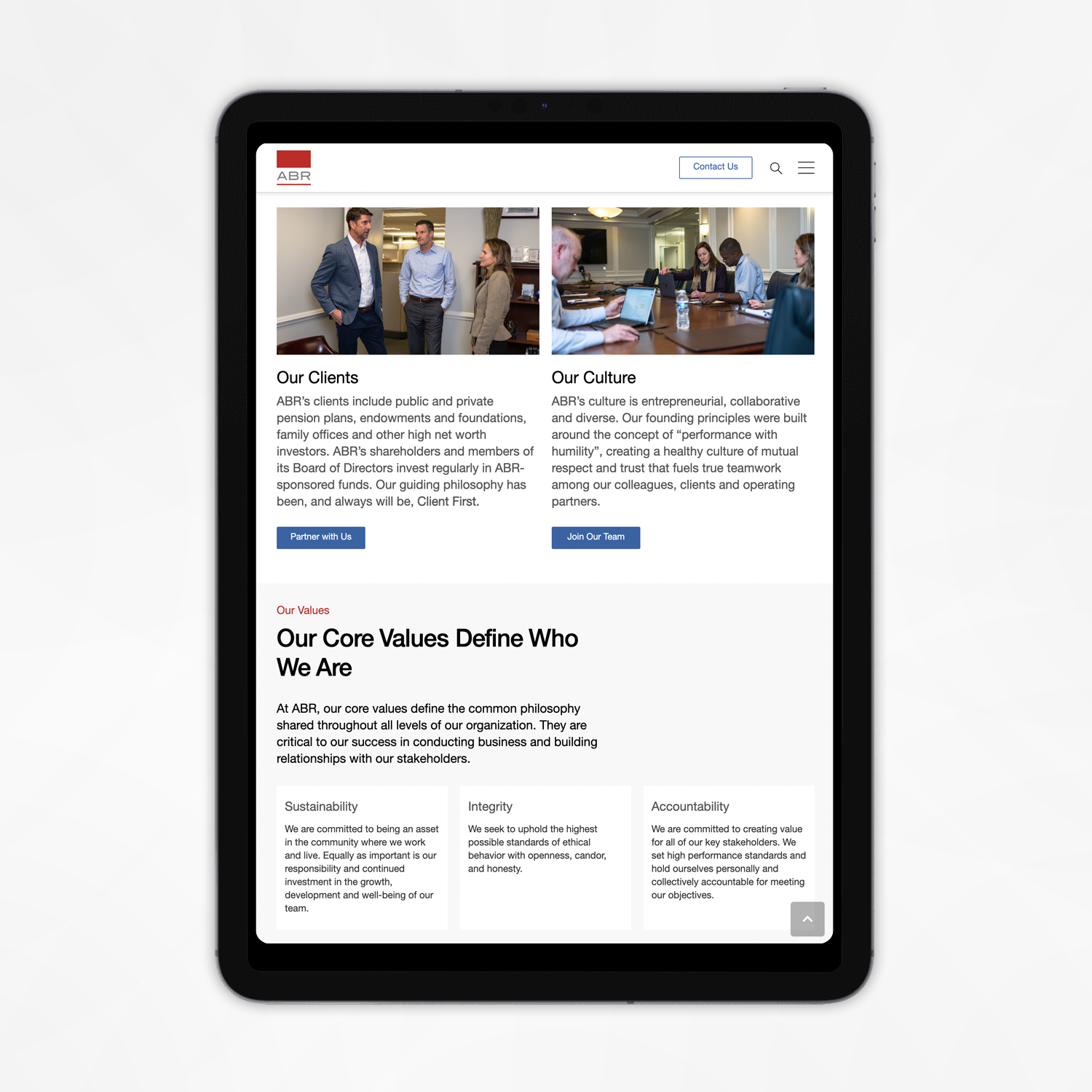
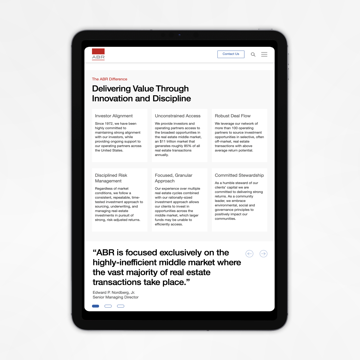
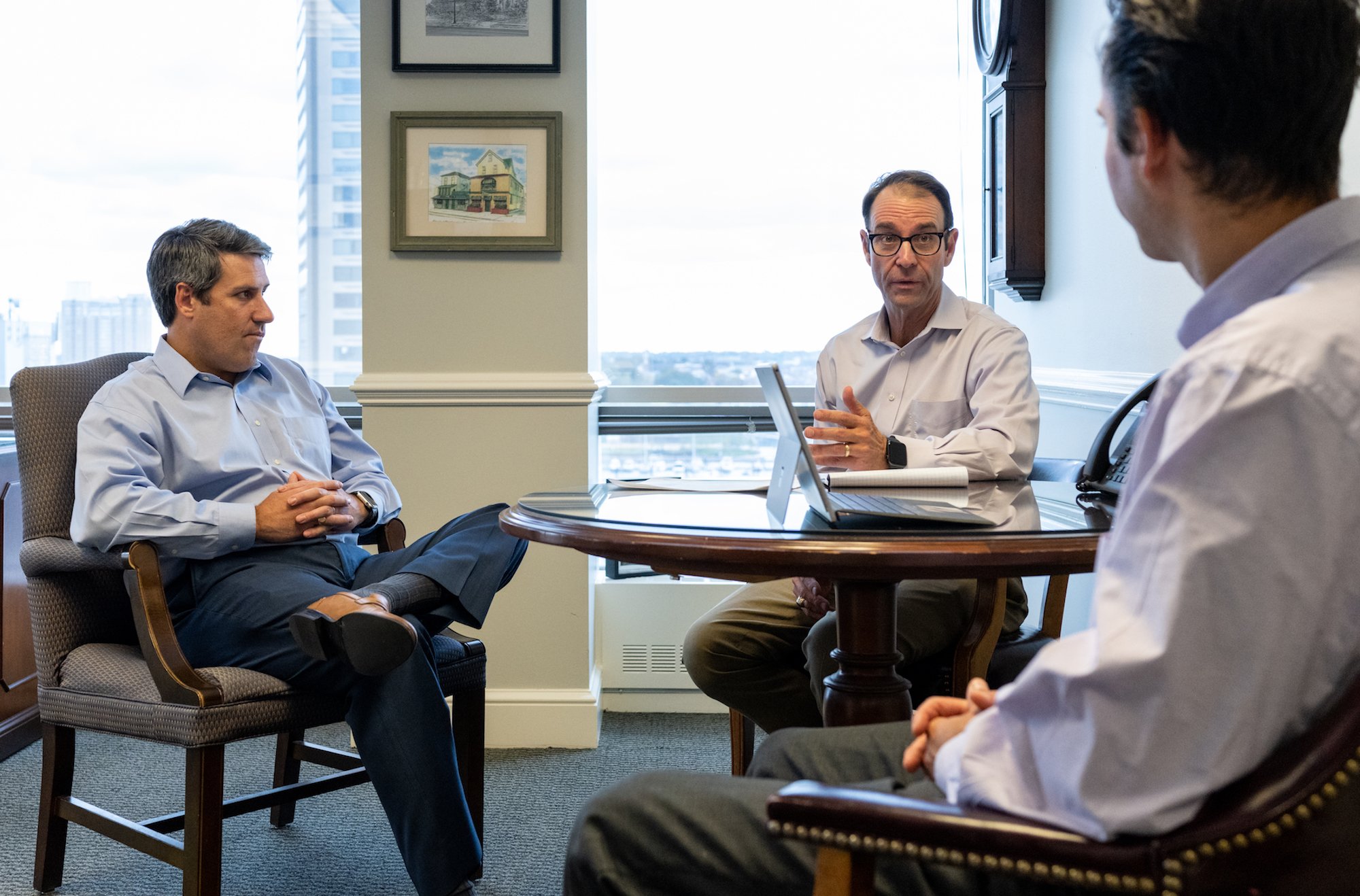
As per the client’s request, the redesigned ABR website was sleek, clean, and minimalistic; as befits the prestige and reputation of the firm. However, instead of utilising complementary stock images, we decided to capitalise on ABR’s premium real estate holdings and the esteemed reputation of its team; using carefully-curated images of ABR’s current investment properties as flavour images around the site, and specially arranging a photoshoot at the ABR offices to capture the team at work and invite clients and prospects to connect with them on a more human level.
We worked with an external photographer to capture these images, but oversaw the shoot in great detail, ensuring that the mood and artistic direction of the photos was just right.


