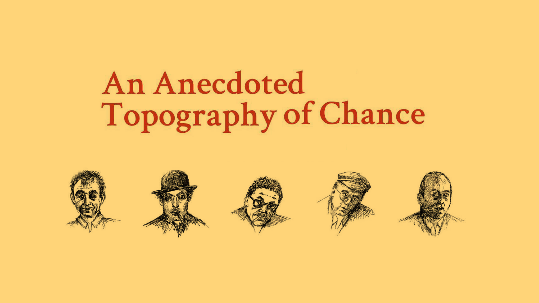
An Anecdoted
Topography of Chance:
The App
UI/UX + Art Direction
(a joint project with Amira Hegazy and Shannon Choi)
Redefining the Fluxus movement’s finest artist book through a lens of accessibility and choice.
“An Anecdoted Topography of Chance” (the Topo) is a seminal Fluxus artists’ book and ergodic novel by Daniel Spoerri, with additions and annotations by fellow artists Robert Filliou, Emmett Williams, Dieter Roth, and Roland Topor.
In this orbital app Spoerri’s Topography of Chance is brought to life by an interactive fully illustrated immersive tableau. Building on the latest “re-anecdoted” version of this iconic publication while prioritising choice and accessibility, the app allows users to seamlessly read through the Topo with ease for the first time in its long publishing history.
User Personas
To build the basic structure of the app, we first focused on creating the hypothetical persona of an individual who would use the Topo app, and their needs and wants. Knowing that the Topo itself is an artists’ book that cultivates more niche interest than general appeal, we developed the persona of Bohr Ingmann, a user in his late 20s with an interest in culture and unconventional narratives throughout history (Fig. 1).
Taking into account the general inaccessibility and “rabbit hole effect” of the original publication, we decided that the app should not try to water down any of its content to appeal to a mass audience — rather, it should focus on funneling the massive amount of content in the original publication into clear and obvious paths that users can choose to explore or save for later, with easy access and as few layers between the users and any end result as possible.
Information Architecture Stage 1 + User Flightpath
Simultaneously, we began collating and organising all the Topo objects, any supplementary material, and any extra functionalities that the app form would allow us to add to enrich the reading experience and enhance the accessibility of the material, i.e. filters to sort annotations by the year they were added, and voiceovers in different languages (Fig. 2 and 3).
We also organised all the content in the Topo in “chronological” order (Fig. 4), i.e. each edition’s introduction in order, followed by the main body of the book, etc.; and also divided our planned functionalities and supplementary material into internal and external elements with their own separate menus (Fig. 5). However, we decided that the introductions were not what users should initially be faced with upon opening the app, and instead went back to Fig. 3 as a base on which to build the structure and flow of the app.
Given the density of the material, we theorised that the majority of users would not navigate the entirety of the Topo in one sitting, and would instead pick at a few interesting objects in the Topo in each session. To carry over the spirit of “chance” from the novel to the app, we made an interactive tableau of all the objects the landing page of the app, from which users would navigate through the rest of the content in a hypothetical user flow drawn out in Fig. 6.
Information Architecture Stage 2
From our user persona and behaviour flow chart, we moved on to the information architecture of the 103 objects within the tableau itself, most of which are interlinked either via Spoerri et al’s annotations and/or via other objects themselves. Some objects’ connections were incredibly convoluted and branching, sometimes even resulting in two pages of almost illegibly small text in the original publication.
Given the Topo’s multiple authors and the conversational nature of their annotations, we decided to visually indicate the author of any given annotation via illustrations of each of the five artists, done by Amira Hegazy. As for the annotations themselves, to encourage (but not force) organic exploration of the text, we made each reference to an appendix item, another author, or another tableau object hyperlink to their respective entries. Users could thus jump between annotations, objects, and appendices with ease. Illustrations of the objects themselves (taken from the tableau) would appear in the sidebar as users progressed through the Topo, allowing for easy backtracking and preventing users from getting lost in the text.
Prototyping + Final Presentation
With our information architecture finalised, we proceeded to wireframe and prototype the app, preparing a variety of entries for the app’s final presentation. We chose to explore user flow paths between the Topo’s shortest and longest entries, as well as a few other interlinked entries that would have cropped up in our user’s exploration path.
Last but not least, we created an illustrated animatic of an introductory video that would play the first time any user opened the app, which would introduce them to the story of the Topo and provide basic instructions on how to use the app, to ensure that users were not confused by landing on the interactive tableau with no further context, while still encouraging exploration and play in the spirit of the original publication.


